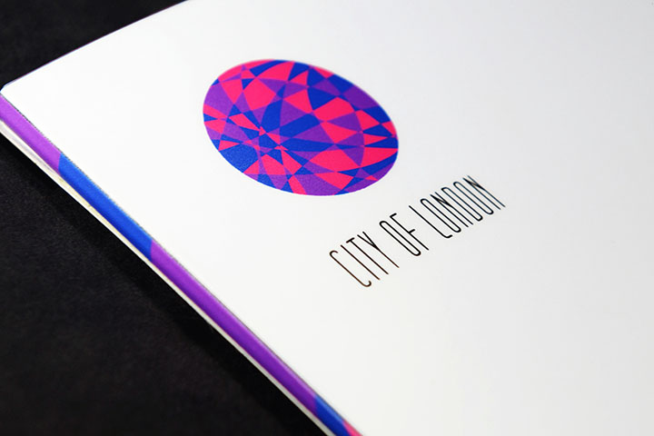
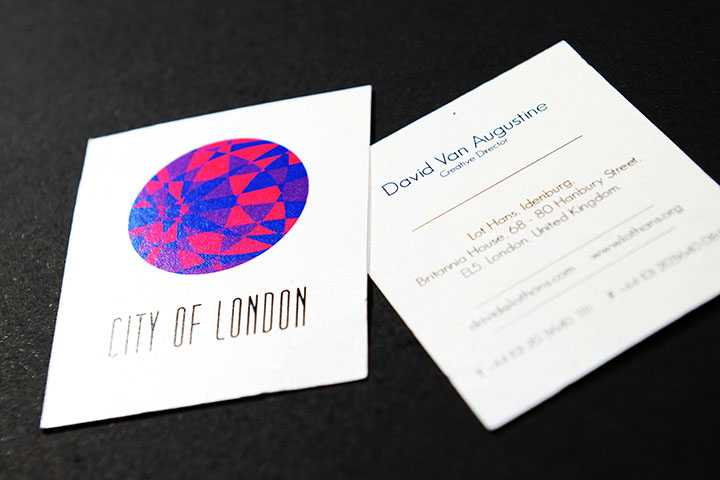
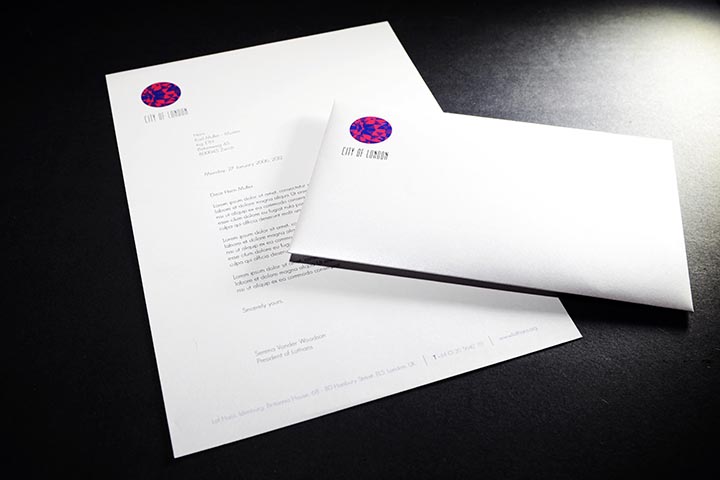
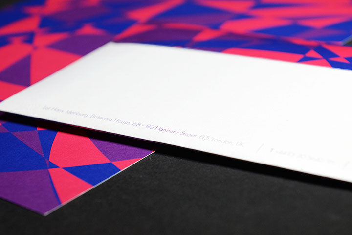
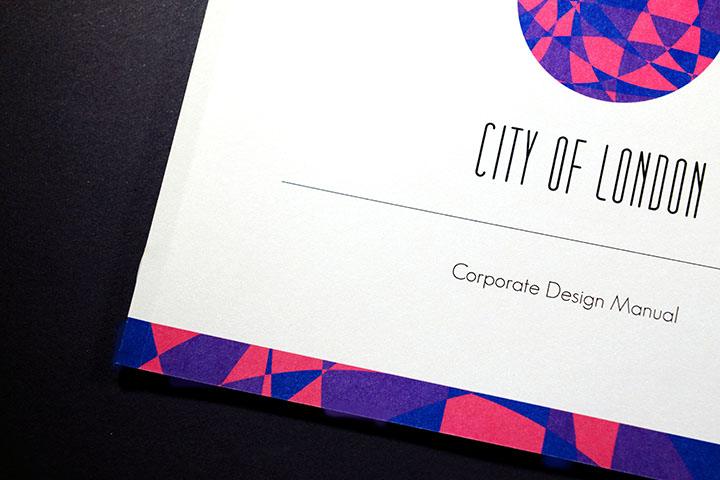
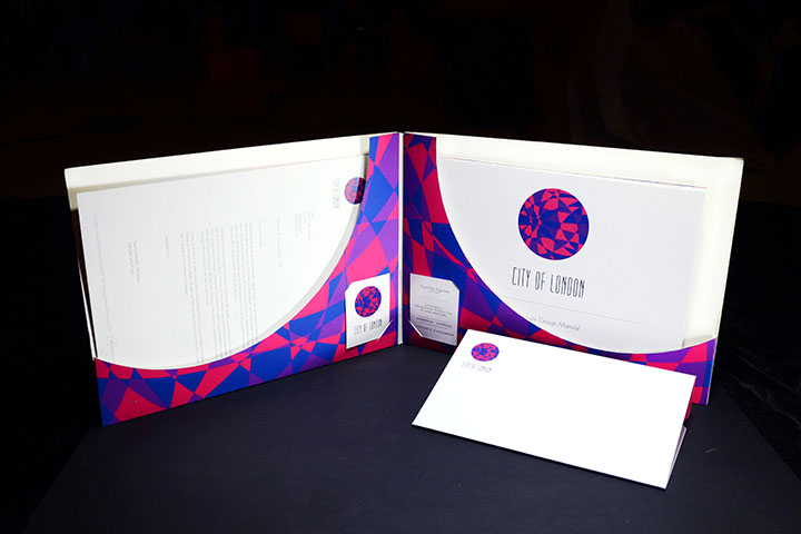
This project was a participation to a competition held by D&AD. Creating a whole new logo to rebrand the City of London in aid of its economic crisis. The solution created was for the City of London to keep moving forward and move positively. Thus the concept ‘London in Motion’. A sphere was used to show the motion of the concept in the logo and the motives of blue, pink, and purple were inspirations from various patterns of the human cell to show ever growth. These colors however were choosen to give a fresh uplift to the City of London incomparison to its traditional blue, red, adn white.